
What We Shipped: Documentation Tool, Updated Display Periods and Data Viz
New features added to the Malartu platform that will make you and your team exclaim, “Ship Yeah!” and high five with data-induced excitement.
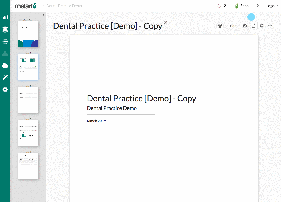
Documentation Tool
There's a lot you can do with your data in Malartu, which means sharing your thought process in building a dashboard can get complex.
Now, from any dashboard or report you can document changes you've made, add notes for teammates to follow, explain your thinking, even embed your own explainer video.
Just click the "i" icon next to your dashboard title and start taking notes.
Look out for more helpful collaboration tools in the near future.Stacked Bar and Pie Chart Updates
Now you can easily see how each section within the visualization contributes to the whole.
By default, each pie chart or stacked bar chart within Malartu will tell you both the value of the metric and the percent value as it relates to its group.
To change your chart to either pie or stacked bar: bring your dashboard to edit mode > toggle the chart option (orange pencil on the block) > chart type > pie
Updated Display Periods
Rolling 6 and 12 month views: Now you can set your display period to be the previous 6 or 12 months from your current month on any block.
To use this new view, toggle your block options > Display Period > Last 12 Months
Updated Data Viz
Horizontal Stacked-Bar Charts: Joining their unstacked-but-we-love-them-just-the-same counterpart, stacked bar charts can now be toggled to display horizontally.
To change the orientation of your stacked back, select “Stacked” from your chart type, then select the horizontal symbol underneath the chart options.
