What We Shipped: 8 New Features to Enhance Your Advisory Services
November 2018 Issue
New features added to the Malartu platform that will make you and your team exclaim, “Ship Yeah!” and high five with data-induced excitement.
Checklists
Checklists allow you add new items and to-dos to any text box. Just type your checklist item, highlight it, then select the newly added checklist icon.
Dropdowns
Dropdowns allow you to add custom dropdown menus as cells within any table, including dropdown options and their conditional formatting. To add dropdowns: Add a table > Select “Add Drop Down” from the Table Options > Add Option > Name Your Option > Choose Color > Save
To copy a dropdown you’ve already created to a new line in your table, click the copy icon beneath the existing dropdown in the metrics section of your Table Options.
Manual Data Entry for Any Table
Many businesses track specific metrics that may not be automated by an integration. In the spirit of data disfluency, you can now flip any card to edit data manually. Simply click the “i” in the top right corner of any card when in View Mode and select “Manually Update This Metric”
Row and Column Totals in Sheets
Put together a completely custom interface to display various class or category data? Want to see what that looks like YTD across all categories? Just toggle the “Show Row Totals” switch.
Cash and Accrual Reporting from Xero
This one’s for the accountants. Now you can build reports from either Cash or Accrual based accounting data. You ask for the freedom to work with both, that’s what you get.
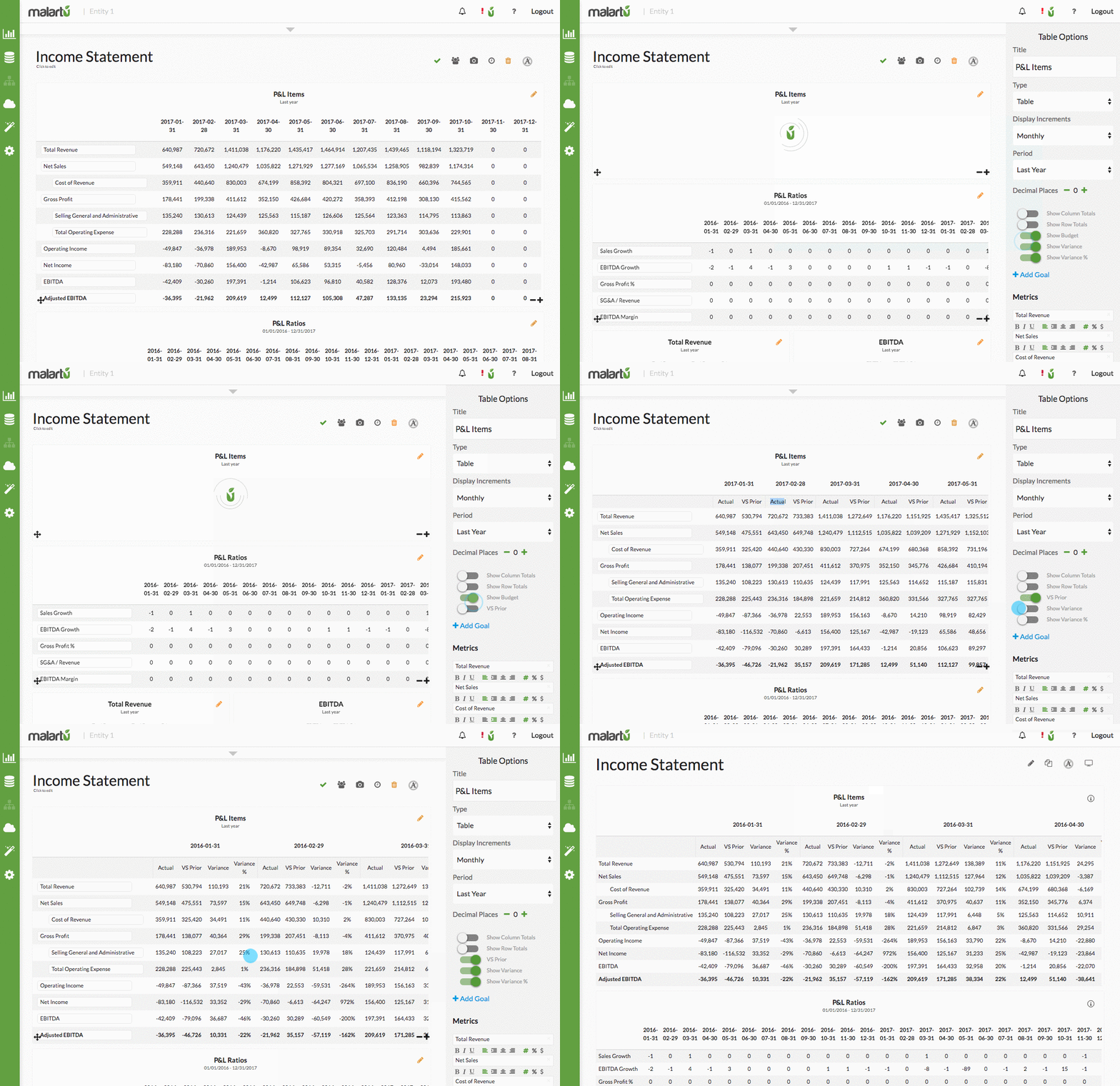
VS. Prior Visualizations and Variance
Easily visualize the prior period of data related to the metrics in your chart by toggling on the “VS Prior” switch from your Table Options.
Quickly calculate your Actuals vs Budget (and Variance) by viewing your table in the default table format, but that’s not all! Same goes for “VS Prior”.
Advanced Goals, Goal Visualizations and Variance Formatting
You can now set a goal or goal range for any metric and visualize that goal in different ways, including by conditionally formatting tables, adding goal lines to visualizations, and more. Depending on the “Good vs Bad” logic applied to each metric, the VS prior variance for that metric will conditionally appear green vs red when “View Goals” is toggled on.
New Visualizations and Themes
We added new visualizations to your Table Options including: horizontal bars, area lines curved, non-area lines curves, area lines sharp, and non-area lines sharp. And of course, you can mix and match all of these by toggling the mix options beneath each metric.
Sign up with us to find even more new updates!
These are just a handful of new features added in the last month. Our product and engineering team have also been adding new integrations and pre-built templates to start with each week.


